
Coastal hues are the inspiration for Plascon’s autumn colour palette

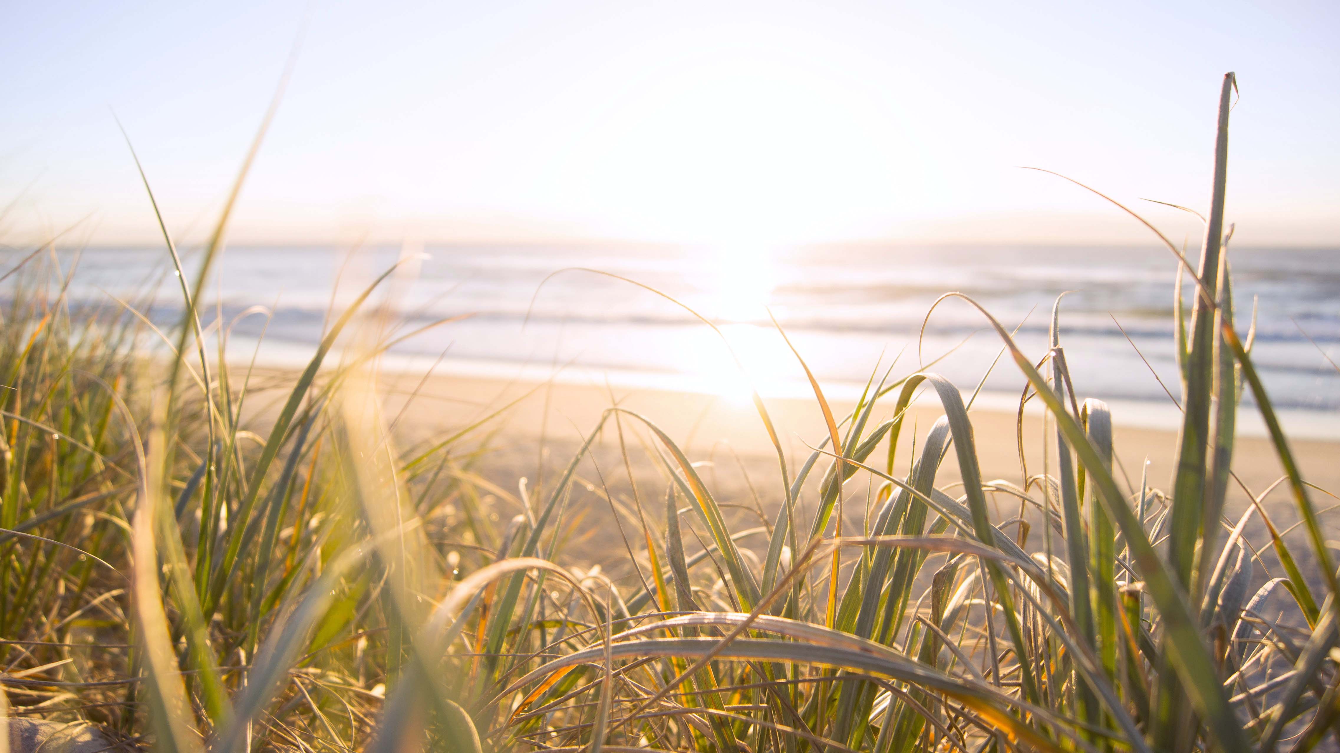
The transition from summer to autumn is typically infused with nostalgia for long, carefree beach days – but you need not say farewell to the freedom and expansiveness of the holiday season just yet.
Plascon’s Colour Advice team has devised an autumn palette of expressive blues, rich reds and shell-tinted pinks that will help you to shore up memories of beach walks, cliff-path discoveries, and mysterious tidal pools. The new seasonal colour collection has been dubbed the Coastal palette.
The rich, inky depths of Plascon Moody Blue (108) and the mid-tone aquatic Plascon Azurbeen (B1-C1-4) bring the timelessness of coastal light to mind, while the light green/blue cast of Plascon Feathery (105) is reminiscent of sea-mist and summer pleasures, bringing a softer touch to your walls. These evocative hues will do wonders for your living spaces, whether you want to recreate an underwater cave or imagine a life on the ocean waves.
The marine hues are complemented by Plascon Hot Terracotta (R5-C1-1) – which delivers a powerful enveloping accent – and tonal partner Plascon Walnut Spice (02-C2-2). Recalling sunsets and sea creatures, the warm pink hues lend a note of sensuality to the tranquil palette. The interplay of light and dark shades mimics changeable coastal moods.

Plascon Head of Marketing, Suvasin Moodley, shares some tips on how to use this palette: “Coastal brings both warm and cool elements into your home; cocoon in a rosy-hued living room or turn your bedroom into a seaside sanctuary with the richness, ease and dreaminess of this versatile palette,” he says.
For free advice on how to use the palette, or any other Plascon colours, please contact the Plascon Colour Advice team via email: ColourAdvice@kansaiplascon.co.za.


