
Plascon Colour Forecast 2017

Colour is not just a part of life. It is life. It’s how we express ourselves, it influences our mood and it helps us to understand our world. As South Africa’s largest paint manufacturer, Plascon not only has an expert understanding of our relationship with colour but also how to make using it easy and inspiring in any space. It’s about combining the science behind innovative paint with the evocative power of colour, all grounded by a deep understanding of the South African culture, style and environment.
ABOUT THE FORECAST
Every year, Plascon publishes an overview of the latest colour trends in their Colour Forecast. This exciting publication gives customers an insight into the trends at play, while at the same time making it easy to interpret them in their own spaces.
These trends are then brought to life with a distinctive palette curated from Plascon’s colour system and expressed through carefully-considered interior and inspiration imagery. There is also reference made to the specific décor techniques that will help customers to recreate the theme in their own space.
KEY PEOPLE
Anne Roselt is Plascon’s Global Colour Manager and has been the driving force behind the Forecast since its inception. “Every year we travel around the globe in search of the latest colour trends and we’re so excited to share them with our customers,” she explains. “We want to really inspire people through the Forecast,” she continues, “and help them to bring trend inspiration to life in their own homes.”
Colour Hive (formerly Global Colour Research) is a collaborative partner, providing global trend insight to the project. They are the thought leaders behind the renowned MIX magazine – the go-to resource for designers around the world when it comes to colour. This is the second year Colour Hive has collaborated with Plascon on the Forecast. As Roselt explains, “they bring an international perspective that is so valuable to a project like this.” She continues, “and it’s by combining this global insight with our deep understanding of the South African taste level, lifestyle and décor preferences that we can create something that is both inspirational and useful.”
THE THEMES FOR 2017 Overview:
The Colour Forecast for 2017 follows a similar format to the issues from previous years, with trends curated around four key themes. These each have a carefully considered colour palette that captures the spirit of the trend, and a suggestion on the décor treatments to bring it to life. Roselt explains that this year’s themes are influenced by the attraction we feel for both the digital and natural worlds. This seemingly contradictory pair is very much a metaphor for who we are as people at the moment, Roselt adds, and that’s why we’re seeing it in colour in many ways.
“Our inspiration this year came from the world we feel under our feet and the worlds we create in our minds,” Roselt says. She explains that we’re seeing a more minimal approach to interiors. “Not that everything is going back to white,” she says. “It’s just that the use of colour is more pure and single-minded
– something we’re seeing in the bold wall treatments and colour combinations this year,” she continues. She explains that this year we’re seeing everything from perspective geometrics to very subtle colour gradations,colour-blocking and everything in-between.
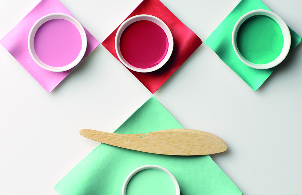
Colour Story One: Anonymous
Anonymous is about the freedom you get when you strip right back to basics and embrace the softer things in life. It’s a new kind of neutrality – beyond a specific gender, identity, place or even style. This approach embraces simplicity and is a response to how oversaturated our lives feel because of all the things that surround us in the world.
The palette combines a lighter blue, green and pink with deep purple, blue and black. Metallic-inspiredshades complete the look and add a sense of depth to the theme. These colours are soothing and calm, giving us space to pause in a busy world.
Bringing this story to life is all about creating an atmospheric feeling with colour. We’re seeing a weightless use of colour for a minimal simplicity, and interest being created with décor techniques like two-toned walls to ground spaces.
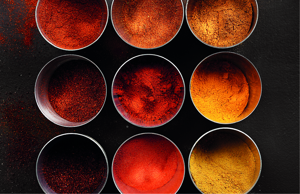
Colour Story Two: Terrain
Terrain is an earthy theme inspired by desert landscapes and colours. It takes the raw forms of these places and interprets them into a warm and easy-to-use palette made up of oranges and yellows balanced by warm neutrals and a mineral green and blue duo.
The trick to using Terrain in a space is to be sparing with the yellow and orange most of the time. Concentrate on the greys and neutrals first to provide a subtle backdrop and then use the other colours as a more energetic accent.
In terms of styling and bringing Terrain to life, this theme is all about using bands of colour to create bold statements on feature walls. Neutral accents really help to complete the natural look and bring the theme to life.
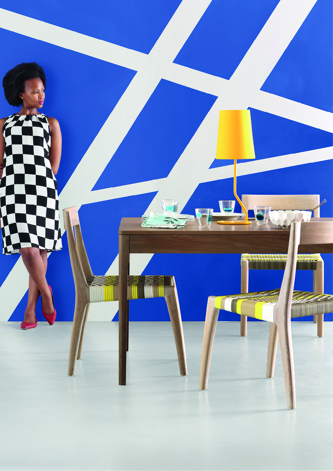
Colour Story Three: Prism
Prism is a youthful and contemporary theme inspired by digital art and features layers of colour being used to create a sense of depth. There’s nothing serious about this story – it’s all about having fun with interiors.
This is probably the boldest theme in terms of paint techniques, and it makes use of prism-inspired and scattered geometric effects on walls. Bands of colour are also used in some places, along with perspective designs, to visually bring the colour off the wall.
The trick is to be bold with colour but remember to contrast the deeper colours with the lighter ones for a fresh, contemporary feeling.
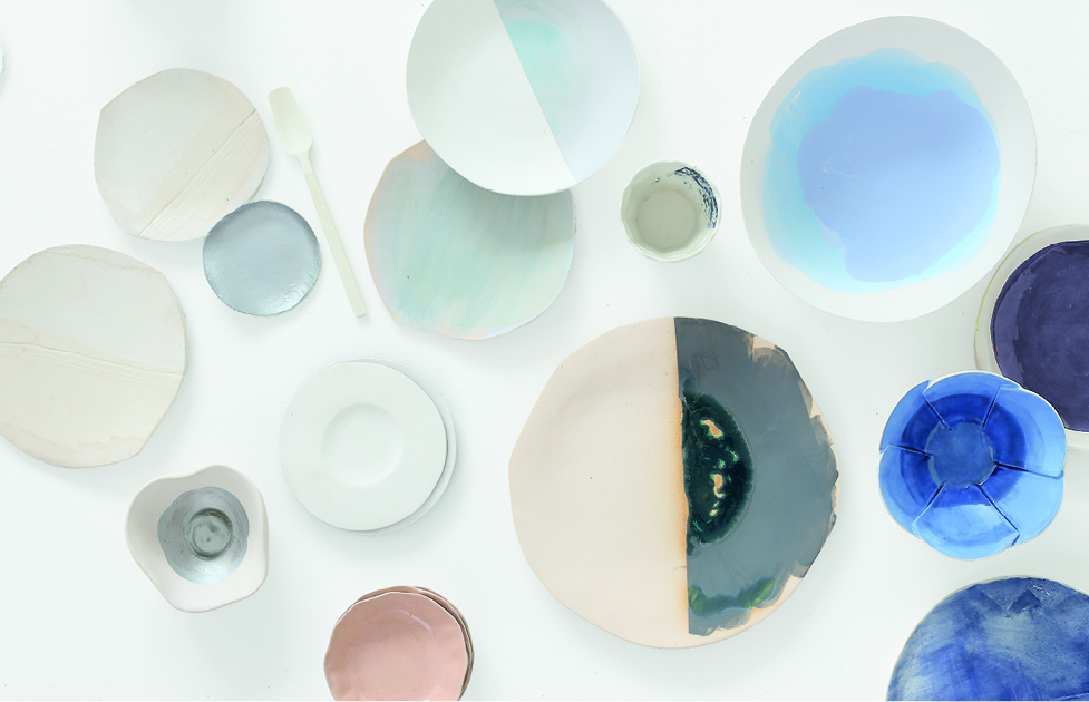
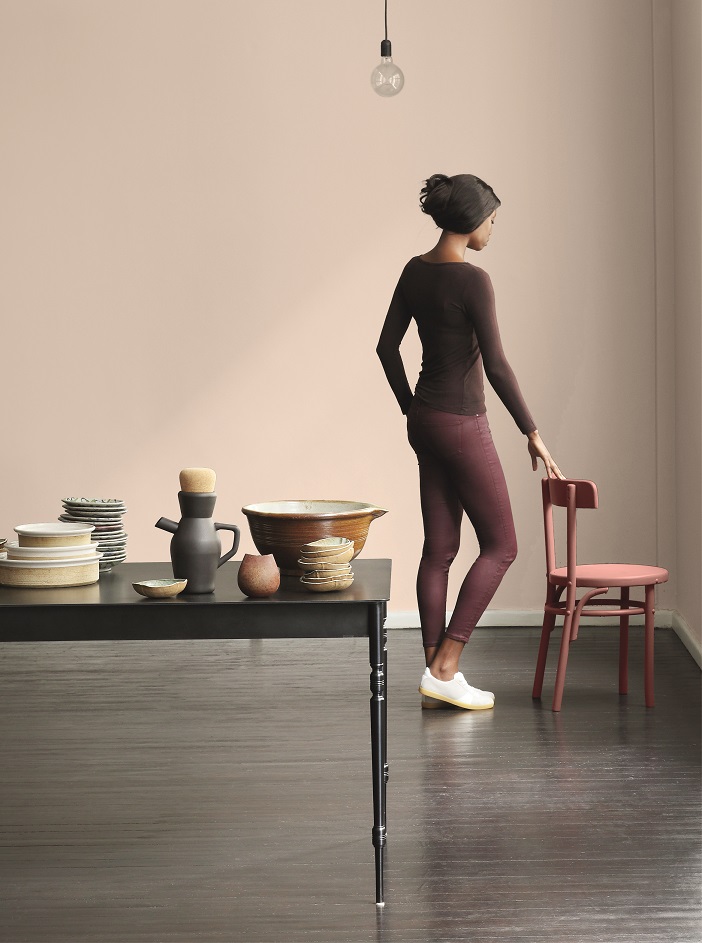
Colour Story Four: Pause
The last theme is Pause – one for everyone who likes a sophisticated neutral look. And while it may be the most minimal and authentic at heart, it has maximum appeal thanks to a nuanced colour palette.
In this theme of hushed colours, we see feminine blush shades as well as grey and blue-tinted updates on classic beiges. There’s also a metallic gold accent on hand to add a hint of luxury. This all helps to create a sense of depth and create a minimalism that is anything but boring.
This sophisticated theme is brought to life through the use of chalky colour treatments for additional texture, as well as faded finishes and colour panels.

THE COLOUR OF THE YEAR
Every year, Plascon chooses a colour that sums up the mood in the global design landscape. For 2017, it is “In the Mood”. Taken from the Terrain story, this is a neutral colour with earthy grey and very subtle pink tints. Warm and grounding but always clean and sophisticated, this colour is the perfect backdrop for any space. As Roselt explains, “It really captures the ‘back to basics’ feeling that the world is going through at the moment but is still rich, warm and really easy to use.”
ABOUT PLASCON
As South Africa’s largest paint manufacturer, Plascon is driven to provide both leading products and useful inspiration to make home decoration easy and exciting. The company is continuously developing new and innovative paint products specifically with the South African consumer in mind and is known for the exceptional quality of its various brands. With trusted names like Double Velvet, Cashmere, Wall and All, Velvaglo, Micatex, and Plascon Kitchens and Bathrooms in its stable, customers know that they can bring their inspiration to life using long-lasting, high-performance paint products, no matter what the application.
WHERE TO FIND IT
The Forecast is launched each year at Decorex Joburg, where the themes are brought to life on the Plascon stand. Copies of the Forecast are then included in leading décor publications around the launch in August, as well as with Plascon’s Spaces magazine. After the launch, customers can visit their nearest Plascon stockist to collect their own copy. For more information, visit us online at www.plascon.co.za