
Embrace the seasonal change with Plascon’s new winter colour palette

We experience and adapt to all sorts of changes in every-day life, whether it is a simple change in weather or unexpected life events. Adjusting to change can be challenging but it is also inevitable and part of being human. With change also comes growth and transformation.
This upcoming winter, Plascon is encouraging us to do something different and venture out of our comfort zones. Plascon’s Colour Advice team has come up with a new palette, Vivid Evolution, that offers a rich narrative featuring deep and sumptuous colour combinations that will dramatically change the way your favourite space makes you feel. Vivid Evolution ushers in peace and encourages quiet moments of reflection.
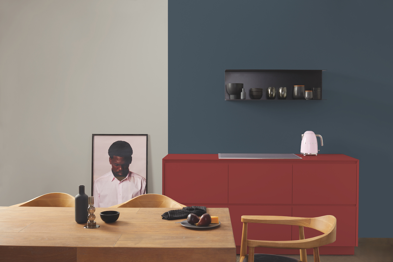
The soft, stylish and neutral grey colour of Plascon Serious (EC 37) works well for both interiors and exteriors. It is a versatile colour that blends in and complements almost any setting. Plascon Timeless Classic (P4-D1-1) is a mid-lavender hue with a neutral undertone, a perfect shade to use as an accent colour, to make you feel pretty and light-hearted. In addition, lavender hues are known to support healing, calmness and renewal and are linked with perception, higher consciousness and insight.
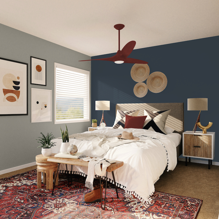
Bring balance into your life with Plascon Urban Rock (B4-E1-2), a dark shade of cyan representing tranquility and a tension-free existence. And finally, Inject energy, passion and style into your space with Plascon French Kiss (R6-C1-1).
Plascon’s Nozipho Kunene, who heads the Colour Advisory Service, shares some tips on how to use this intensely deep and bold palette: “Elevate your room by painting your ceiling the same dark hue as your walls. The natural boundaries and edges of the rooms will be blurred thereby making the room appear larger and the celling higher. Bold colour schemes are a great backdrop for neutral furniture and can modernise the look-and-feel of the space. In high-traffic areas, darker hues are great for hiding all the little flaws – from dirty finger stains to
irregularities on the walls.”
Why be like everyone else? Rich and pigmented tones feel luxurious and create an intimate interior scheme. So, break the off-white norm and celebrate bold colour with Plascon’s newest colour palette, Vivid Evolution.
For free advice on how to use the Vivid Evolution palette, or any other Plascon colours, please contact the Plascon Colour Advice team via email: ColourAdvice@kansaiplascon.co.za.


