
Here’s why the latest term on design enthusiast’s lips, Japandi is taking interiors by storm

With a 100% year-on-year increase in Pinterest searches, Japandi is the latest trend to beautify homes. But unlike fads that come and go, Japandi holds an element of timelessness that not only reveals a long history but points to a long future as well.
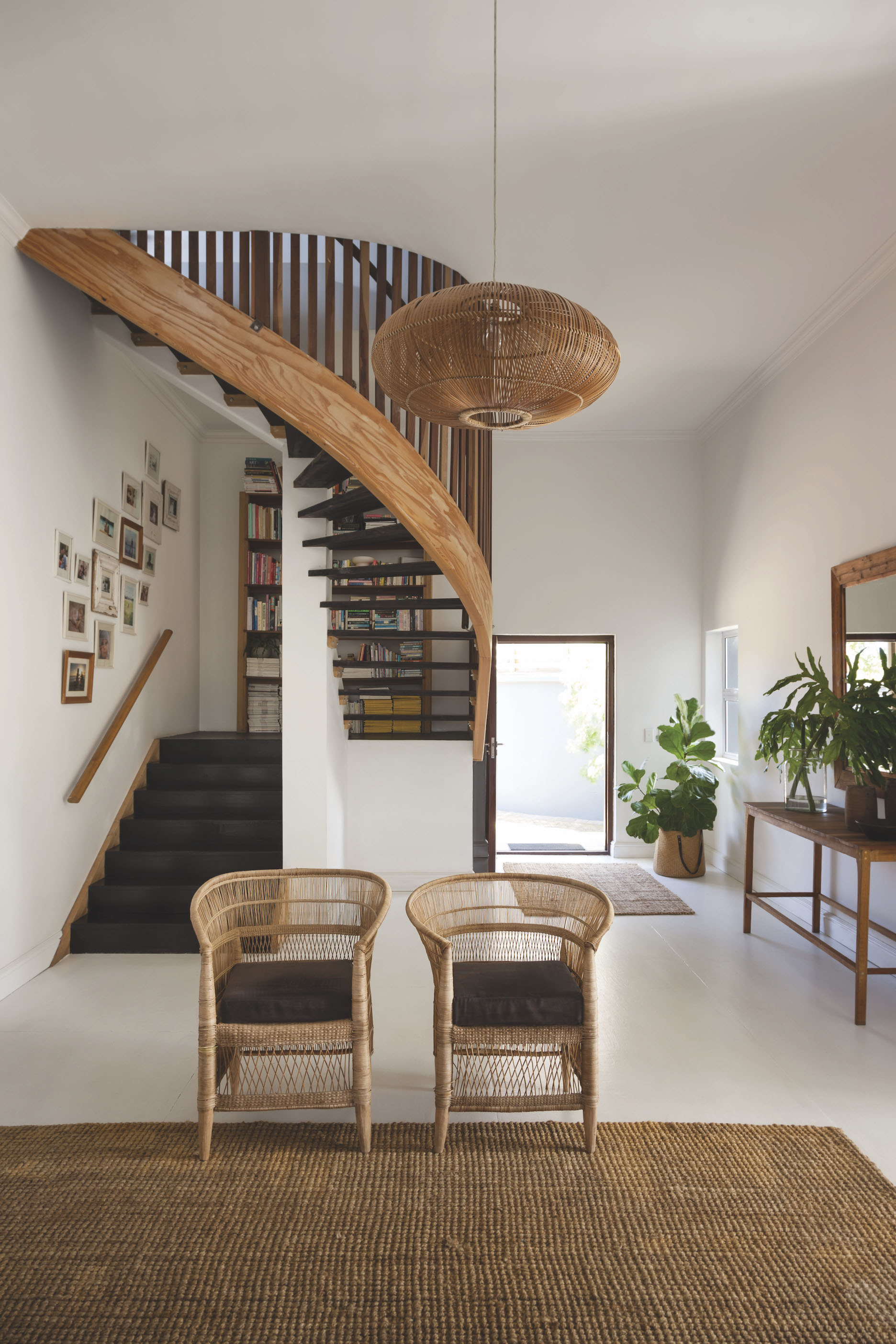
A fusion of Japanese and Scandinavian design, Japandi aims to create clean, calm and harmonious spaces. The two schools share design principles of simplicity, functionality, natural materials, and craftsmanship. The Scandi notion of ‘hygge’ and the Japanese ‘wabi-sabi’ harmonise to create stress-free atmospheres and spaces.
With attention to detail, meticulous craftsmanship and timelessness deeply rooted in both Japanese and Scandinavian design, Japandi is more than a passing trend. The natural cohesion between the two has embedded Japandi as design DNA with many designers, a style to which they continue to turn, and increasingly so.
Despite being a hot topic now, these intertwined principles can be traced back to a trade and cultural exchange that started 150 years ago between Denmark and Japan. Fast-forward to today, Japandi’s sleek lines, calming set-ups and neutral colour schemes make it the perfect antidote to our modern, busy lifestyles and the intense societal shifts of the past year – further embedding itself as a trend that is here to stay.
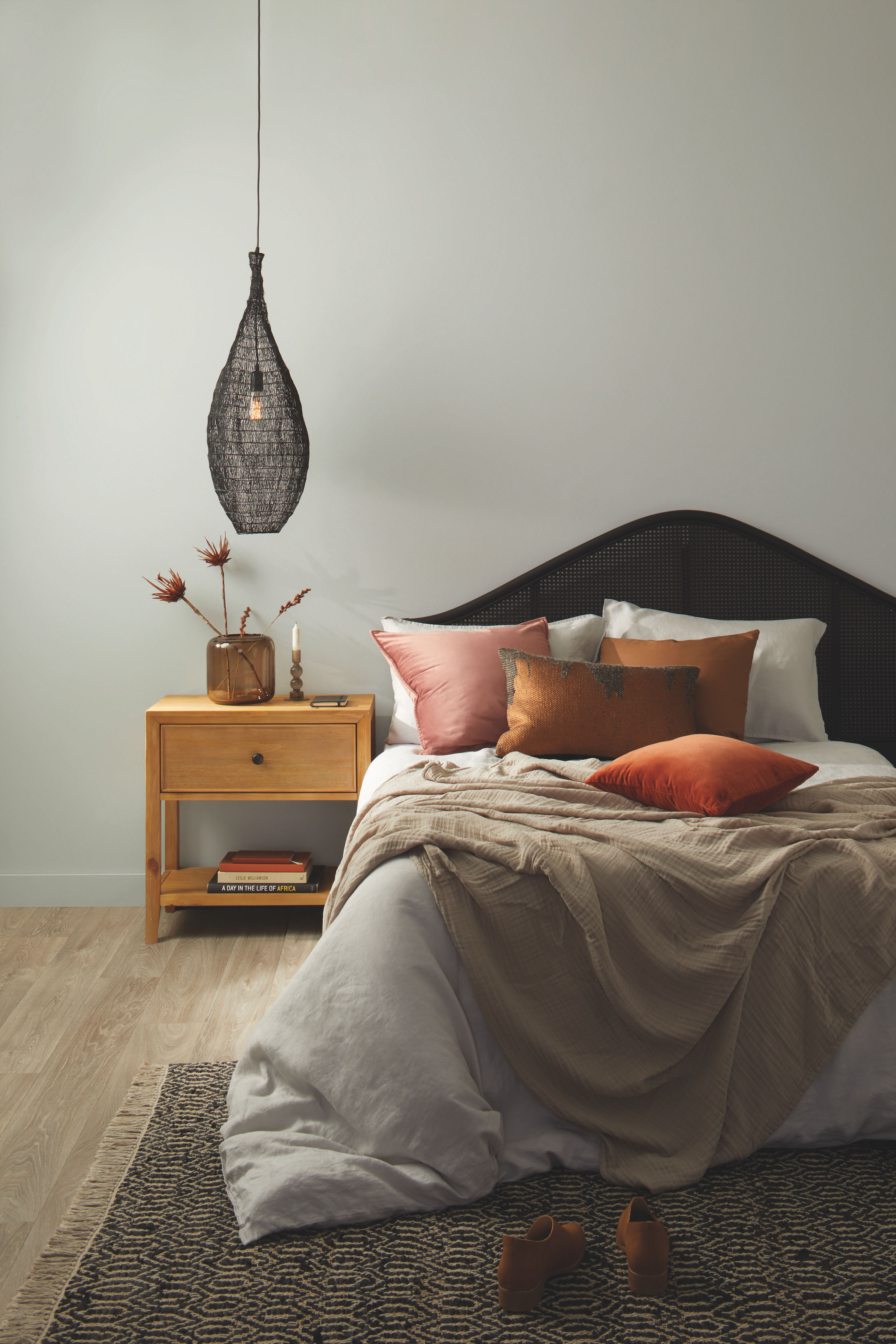
Plascon, ever with its eye on the design radar, has created a new colour palette to capture the hearts of Japandi and minimalist enthusiasts alike. Creating a harmonious contrast of Japanese light colours with the more neutral, darker tones of Scandinavian design, the Plascon Japandi palette offers the flexibility and versatility to incorporate Japandi in a way that works with a variety of décor styles.
The lighter tones of the palette, such as Plascon Light Reflection (Y6-A2-3), are the perfect complement to spaces full of light, containing simple shapes and natural elements. Their light neutrality and wooden tones speak to the minimalism of Japandi.
The darker tones offer the opportunity to create a deeper, calming contrast while still maintaining that zen atmosphere. Plascon French Shutter (83) is a green associated with meditation and brings a sense of peace and calm to any space.
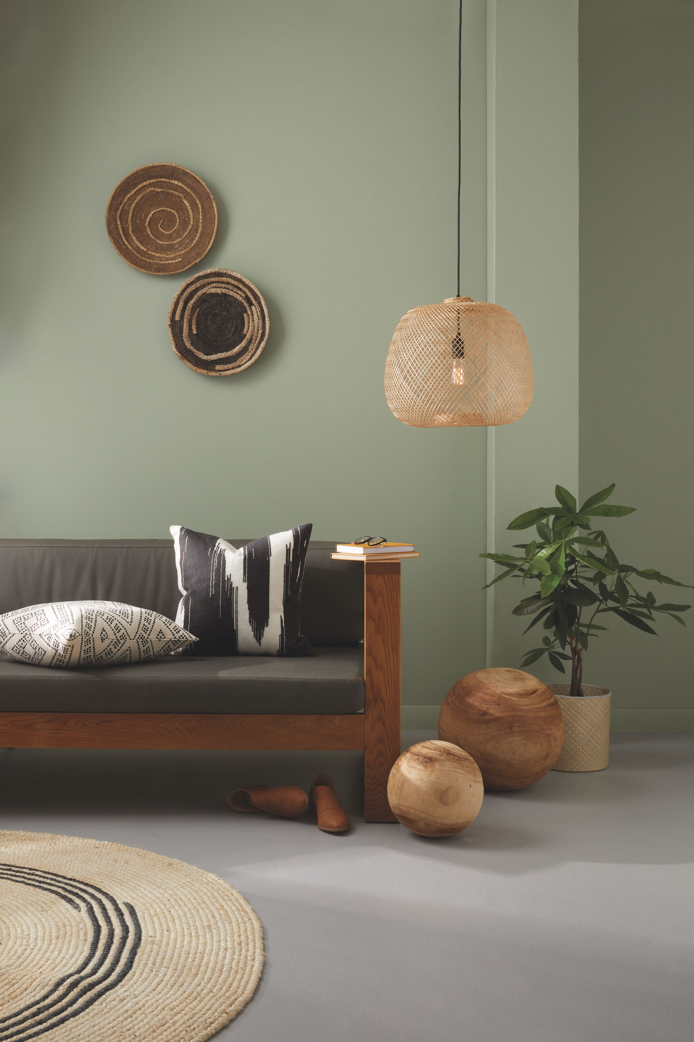
The brown hues of Plascon Waxen Tint (Y2-D2-1) and Plascon Black Bean (71) will work in spaces with earthier, warmer tones. While the cooler green-grey tones of Plascon Nomadic Dream (56) offer a lighter, sleeker alternative.
The resurgence of Japandi principles and aesthetics are well suited to those seeking to venture into minimalism or to create safe, meditative spaces that offer a chance to rejuvenate and unwind.


