
Keep it neutral: The best colour palette to attract buyers

While most estates have recommended colour codes with regard to exterior colour choices, for the most part, these tend to sit within the neutral spectrum. The options present as either a choice of a few related colours, or one dominant colour for walls, with a matching accent colour for trimmings. There are many reasons for this, such as consistency of aesthetics across the development, but one main consideration is the potential resale value.
While a certain individual might value shocking pink walls, it is not a commonly loved choice. It is safer and more practical to choose paint colours that will be most effective in attracting the widest range of buyers and that won’t present them with the added cost of repainting if they don’t like that bright pink, for example.
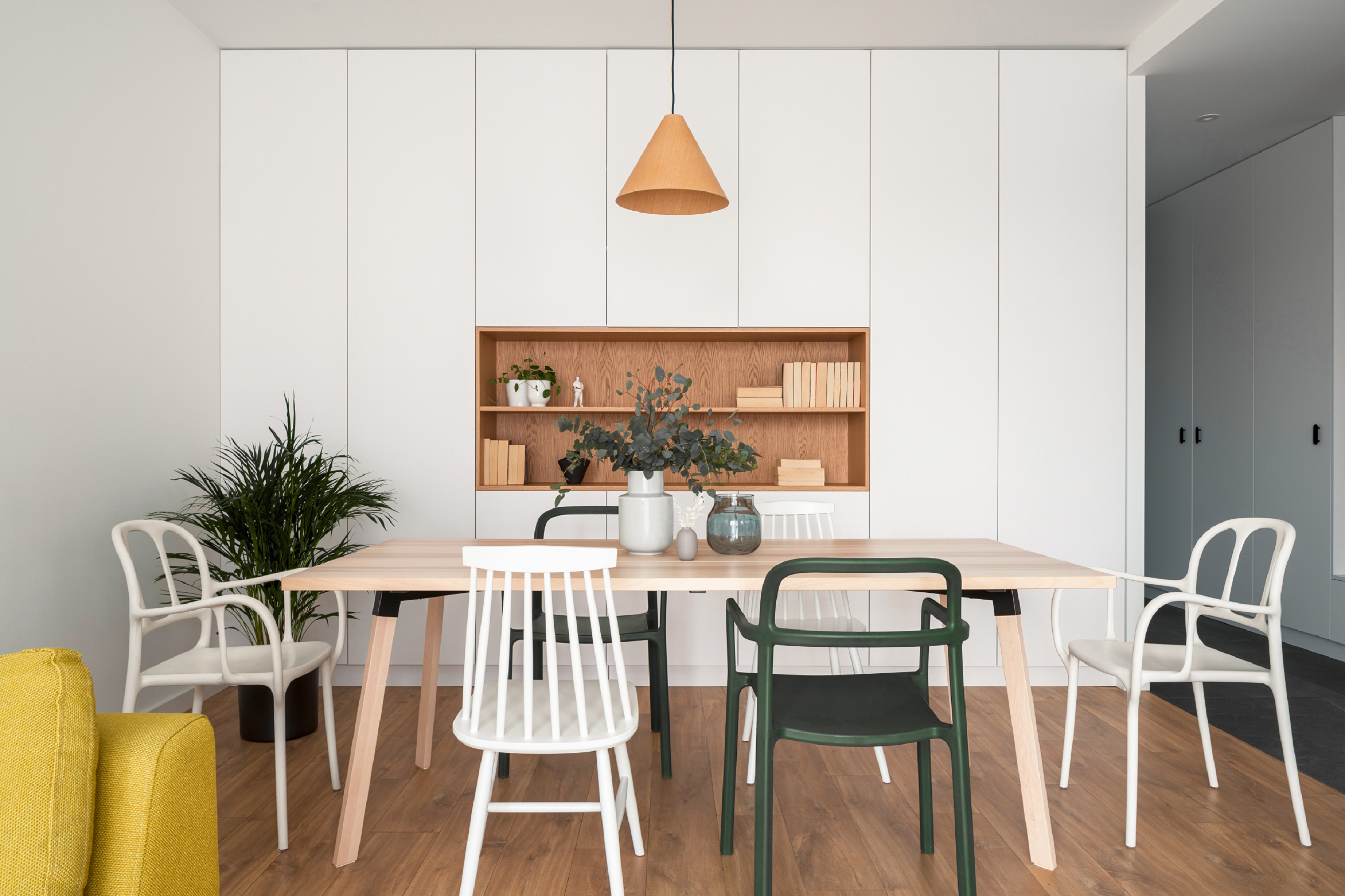
You may look at the word ‘neutral’ and think it is limited to white, white and more white, but neutrals are much more nuanced than that. Apart from white, which is still an incredibly popular choice due to its heat reflecting ability and appearance of cleanliness, there are off-whites, beiges, greys and ‘greiges’ (a mix of grey and beige) in a vast array of tones and hues. The great thing about all of these colours is that they go with each other and with everything else – whatever the landscape, and whichever choice of neutral the neighbouring homes are painted.
If your estate is a new development that has yet to choose its colour palette, or if you’re an existing estate that wants to change its colour direction, then warm whites, beiges and greys are undoubtedly the best options for painting exteriors to attract potential buyers. The Architectural Greys range from Plascon has a wonderful selection of grey hues, like GR-Y06
Orchid Bay, GR-Y04 Mandarin Tusk and GR-Y05 Antique Petal, that will create a sophisticated yet subtle appearance. In the Essential Collection you’ll find a range of beiges and off-whites, like 4 Salt Pebble, 7 Frothy Milk, 1 Evening Mist and 13 Alpaca, that provide warmth and make spaces feel welcoming.
“Picking neutral colours is actually about more than just creating a blank canvas for potential buyers — they help make small spaces look bigger and dark spaces brighter,” advises Caroline Ras of Plascon.
For estates that are south-facing or placed in the shadow of a mountain, and where the homes are on the smaller side, white is a perfect choice of paint colour. This is because white doesn’t absorb any light or warmth, it reflects light that comes its way to create the illusion of a bigger space. We recommend using Plascon’s standard white to achieve a crisp white look, or picking more subtle off-white colours like Ray of Light 07-A2-3 or GR-Y05 Antique Petal. Black obviously does the complete opposite, absorbing light and making spaces look smaller — which is why we recommend steering away from darker charcoal and greys unless they are being used in small doses.
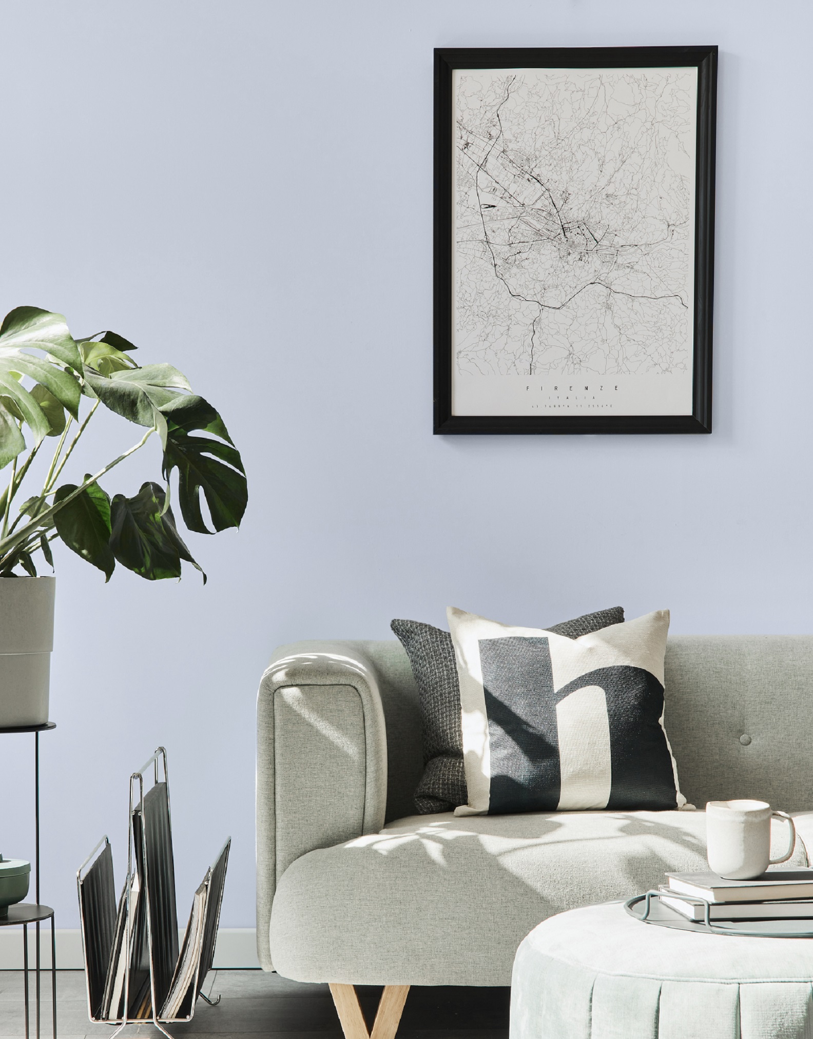
‘Natural’ is another word that we like to use when looking at paint colours to best attract new buyers. They can be incredibly effective in creating a calm atmosphere which can help potential buyers feel welcome on first viewing. There are definitely benefits to bringing in subtle touches of colour like 84 Light Sage, 92 Nutter Butter, G2-E2-1 Briar Green and O6- E1-3 Maple Tree to create depth and counteract the starkness of whites and greys.
In short, neutrals are the key to attracting the largest possible pool of buyers, instead of trying to appeal to a select few. By opening up estates to a bigger potential market, they help fuel demand and ensure the appreciation in value.


