Bright New Afro-Futuristic Campaign for 100% Design South Africa 2016!

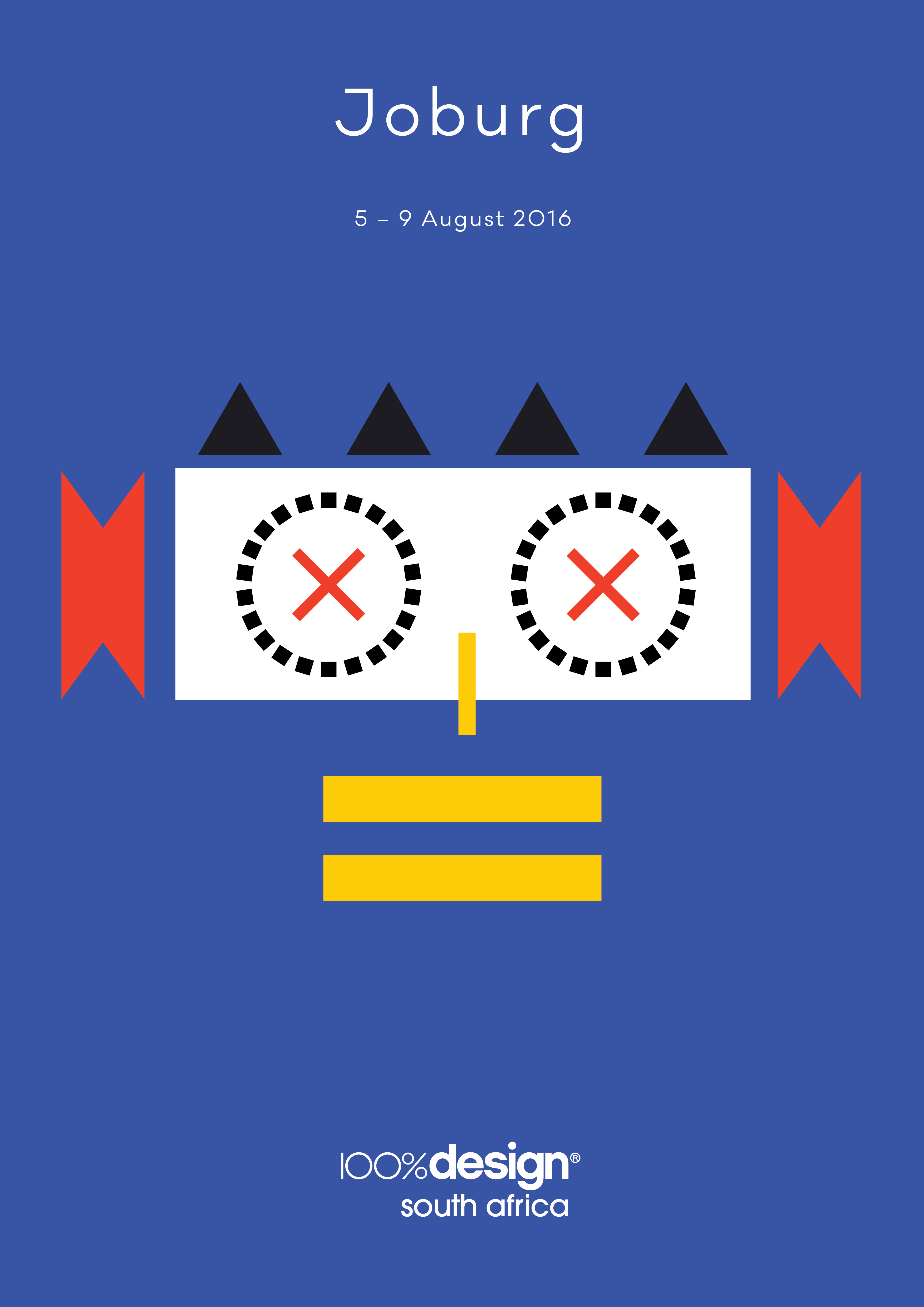
Bold patterns, vivid colours and geometric shapes, evoking elements of traditional African masks, will infuse 100% Design South Africa 2016 with a sophisticated Afro-optimistic spirit.
The eye-catching 2016 campaign is the result of an exciting collaboration between the show and top branding agency, Deep Design, who conceptualised the new graphic identity and execution for the show’s third annual edition, due to be held at Gallagher Convention Centre in Johannesburg from 5 – 9 August 2016.
“The 2016 graphic campaign takes its cue from the rich visual traditions in Africa interpreted in a thoroughly contemporary way,” explains Cathy O’Clery, Programmes Director for 100% Design South Africa. “The sleek yet playful palette combined with the use of basic shapes creates a wonderful toolkit. It will play out in a myriad of creative executions giving the whole show a distinct and directional identity.”
Deep Design’s Creative Director, Adam Shear, who steered the creative production of the campaign, credits the influence of African patternmaking and tribal masks as the point of departure for the graphic identity for 100% Design South Africa 2016.
“Part of the attraction to African patternmaking is its naïve sense of alignment and shape, which from a Western design perspective could be seen as imperfect, but it is precisely therein that lies the beauty,” he muses. “We asked ourselves how we could build from this rich playfulness of basic shape.”
For the audacious colour palette he drew inspiration from the quintessential Afropolitan, Joburg, which is also the home of 100% Design South Africa. The inner city streets are a backdrop to a dynamic fusion of high-end design and make-do craft, couture fashion and traditional wear, street art and sleek new architecture, spaza shops and high street sophistication.
“Our palette came from taking a primary selection of colours (red, blue and yellow) and working with their tonal values to add a bit of ‘African city’ grit,” Adam elaborates. “Hence the yellow is a little golden and the blue is deep. We added a complementary dirty pink that we feel brings a layer of sophistication and modernity to the palette. Classic black holds the set together beautifully.”
The result is an exuberant Afro-urban statement, celebrating a powerful locally-inspired aesthetic. The through-the-line campaign, which is attests to the power of great graphic design, reinforces 100% Design South Africa’s track record as the country’s premier design show.
“We are very excited to be working with the forward-thinking team at Deep Design,” says Laurence Brick, Creative Director of 100% Design South Africa. “The striking campaign is a wonderful example of the magic that can happen when you bring talented designers together with a great brand.”