Inhouse Brand Architects bring a striking simple modern functionality to Saatchi & Saatchi’s Cape Town offices

Leading design agency, Inhouse Brand Architects was recently called in to re-imagine the Cape Town offices of trailblazing advertising agency, Saatchi & Saatchi. Having previously completed highly successful office refurbishments for other agencies like Ogilvy and 99c, the award-winning Inhouse team was a natural choice for Saatchi & Saatchi, thanks to its experience in changing the traditional structure of the professional environment for the better.
Saatchi & Saatchi needed to remodel its Cape Town premises because the Saatchi & Saatchi SA group recently acquired an additional agency, BrandsRock, and as a result, the group’s Cape Town offices located at The Foundry in Green Point needed to expand. Inhouse was briefed to give the space a thorough overhaul that would convey the dynamic creativity for which the agency prides itself.
 Saatchi & Saatchi’s progressive ethos of “Nothing is Impossible” infused Inhouse team leader, Annelise Botes’ design concept from the start. Bright and bold colours contrast with the more sedate; irregular lines immediately lend an air of unconventionality to the space; and playful pop culture references abound. The ground floor reception area was the focus of the project, needing to instantly signal a contemporary corporate culture that welcomes dialogue and collaboration.
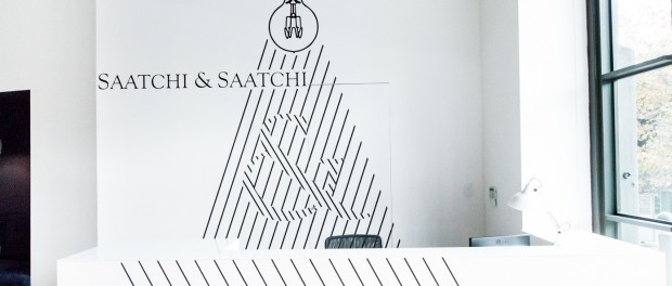
The collaborative spirit that underlines the Saatchi & Saatchi brand is consistently referenced through the use of large-scale signage featuring ampersand symbols – an eye-catching feature that reinforces the spirit of collaboration and possibility. A cascading graphic forms the backdrop to the reception area.
In addition to a meet-and-greet space, the reception needed to have a dual function: due to a lack of group activity areas elsewhere in the office, it was important that the reception function as a core meeting and mingling place for the newly expanded company.
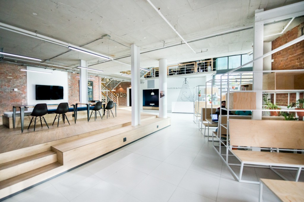
In response to this need, Botes immediately opened up the area, removing walls that paradoxically created a sense of constriction and confinement.
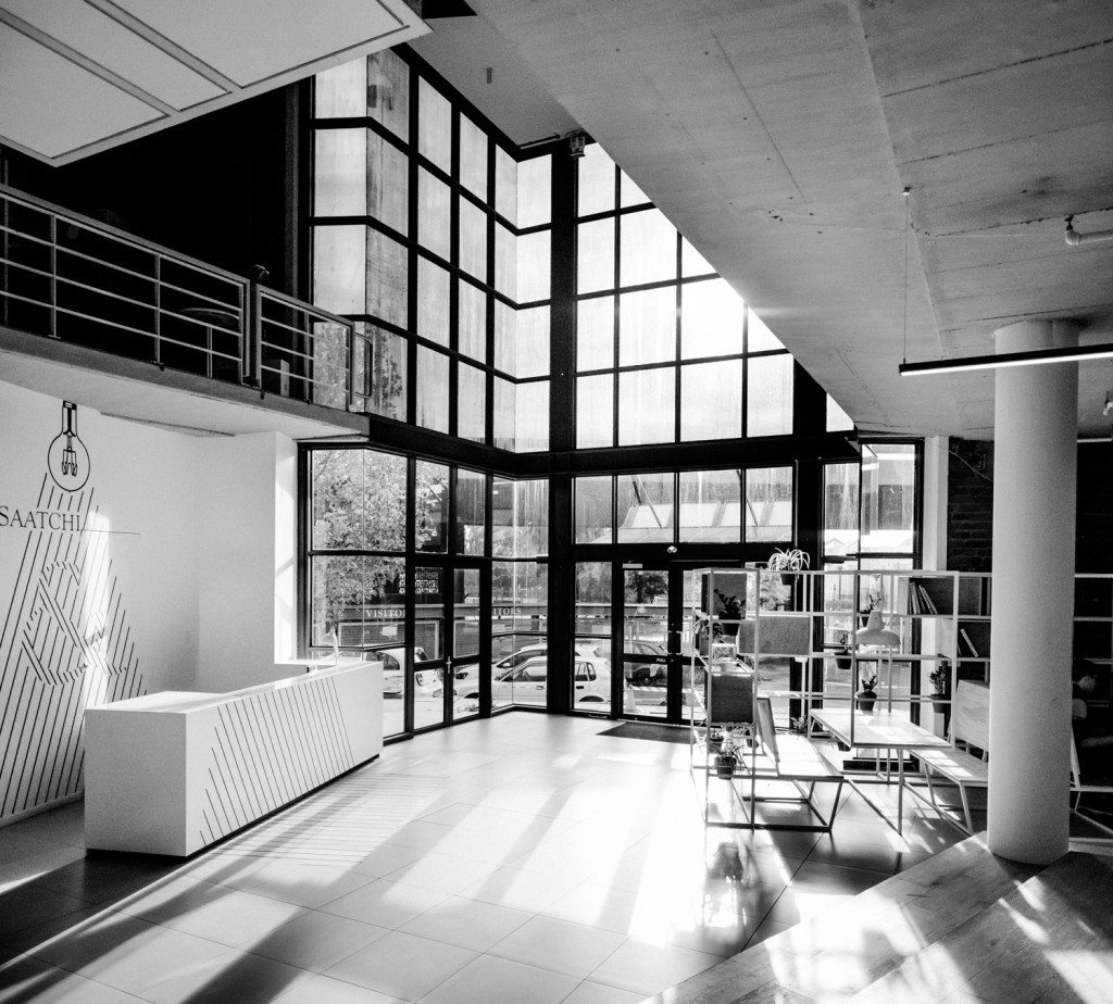
Instead, the levels above are now visible and this creates a greater flow within the environment. Reinforcing this, brickwork and industrial fittings are left exposed. These features date from the original use of the building as a factory and add a utilitarian feel to the space that speaks of functionality.
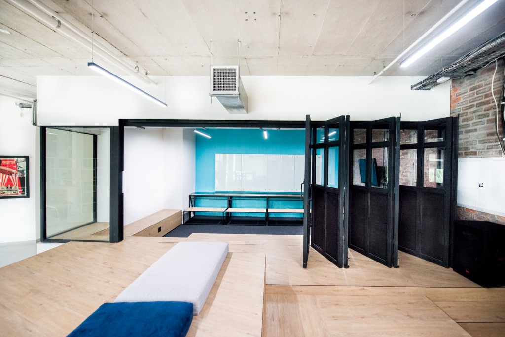
This sense extends into the main reception area through the use of streamlined finishes and furniture. The simple steel and wooden planters that greet visitors upon entering, also provide private conversational space while simultaneously acting as a display unit for the numerous awards the agency has won. A large meeting room that runs alongside has folding glass doors that can be opened so as to enlarge the holding capacity of the room and seating benches and tables are easily rearranged. In addition, lounge furniture is dotted around the ground floor space.
The need for spaces that are adaptable and suited to a variety of different purposes is an ever-increasing necessity for the present-day workplace. Saatchi & Saatchi’s refurbishment reflects this through the creation of spaces and custom furnishings that are designed to be multi-functional. Now, the offices function in a way that incorporates different work styles, while provides an open and vibrant entrance area that transmits company values and brand identity. Multi-functionality truly at its finest!


