Leading Property Development Firm Berman Brothers Group Gets a Luxurious New Makeover
Inhouse Brand Architects has constructed a sleek, masculine image for the corporate offices of the Berman Brothers Group (BBG) – a leading property development firm in Cape Town. The design concept sees raw construction materials transformed into signature elements that pay homage to BBG’s very own building blocks.
When asked to design the new Sea Point offices for BBG, Inhouse Brand Architects took the bulk of its design references from the origins of BBG’s success in the building industry – its raw materials. Basic construction elements such as reinforced steel, exposed concrete and rebars have all been reimagined into iconic statements in a decidedly masculine space. The overall effect is sophisticated and startling for its design ingenuity. Extremely high-end finishes serve to contrast with and elevate raw construction elements, creating an impressive sense of cohesion.
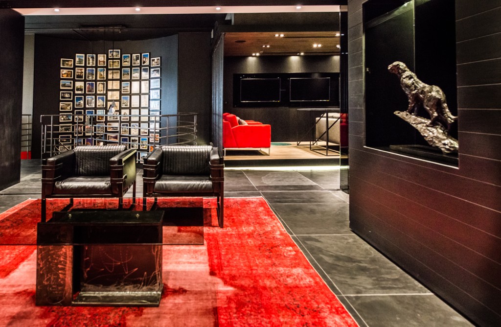
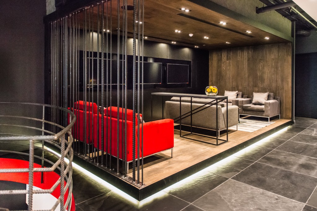
The client’s brief was to develop a world-class interior that both reflected the BBG brand and accommodated the company’s various needs. The wishlist included well-appointed private offices for the owners, Paul and Saul Berman; a large, open-plan seating area for staff; informal meeting spaces; private meeting rooms; and business lounge arrangements.
For Inhouse Creative Director Aidan Hart, the project was an exciting challenge not only because of the design input that could be provided, but also because the client was extremely discerning. “Paul and Saul Berman are very dynamic individuals and successful entrepreneurial businessmen who came with high expectations of both quality and style, having built their business in the building and property development realm.”
For its new premises, BBG elected to occupy two floors in the same building linked by an internal stairwell. Inhouse’s space planning for the project demarcated the upper floor as the client-facing area, with the working floor or boiler room below. It was important to Hart that there be visual connectivity between the two areas, despite their different functions.
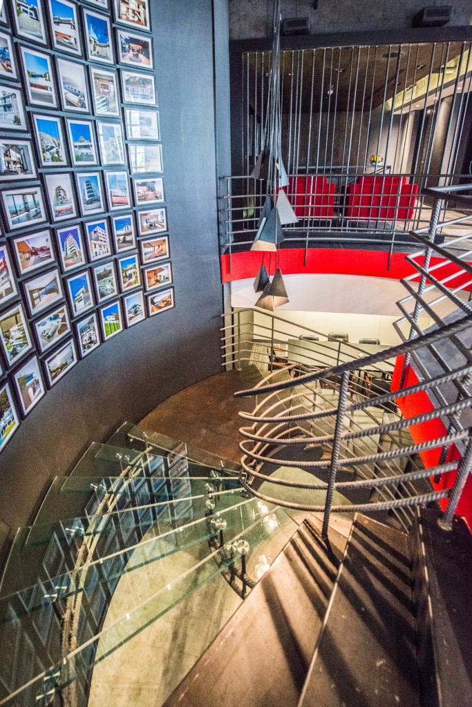
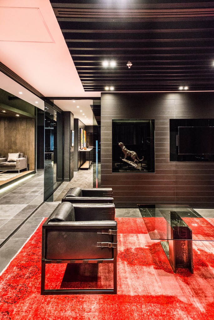
This visual connection was achieved by cutting several circular sections, or “portholes”, through the concrete floor slab to expose both the reinforced steel structure supporting the floor and the workings of lower level beneath. Toughened glass finishes off these round windows to the worlds above and below.
To further connect above and below, Inhouse deconstructed the stairwell between the two floors. The cantilevered, floating staircase boasts an exposed reinforced substructure that carries glass treads that connect two concrete spiral sections. The large curved wall behind the stairwell stretches between the levels – again, reinforcing the connection between them – and houses a photographic display of BBG projects. Rebars were cleverly used as handrails for the stairs.
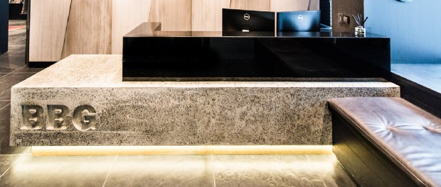
These same, common rebars were welded into an arresting and unusual screen that greets guests as they come into the front reception area. The reception desk itself is moulded from concrete, complimented by a raw marble sheeted back wall featuring diagonal sections.
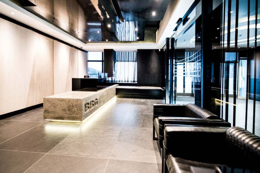
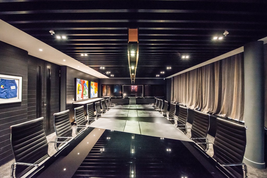
Several custom-made furniture elements are detailed around building equipment. Ryan Matchett designed an impressive boardroom light resembling an i-beam and Dark Horse supplied various furniture elements which complements the masculine interior and construction focus.
The advanced level of customization and bespoke design really distinguishes this project. According to Inhouse designer Jenine Bruce, “Everything was custom-designed, from the doors to the boardroom table. And that’s such a feature of the space.” Even the door handles were custom-made (they’re large, vertical plates of steel with slots in them).
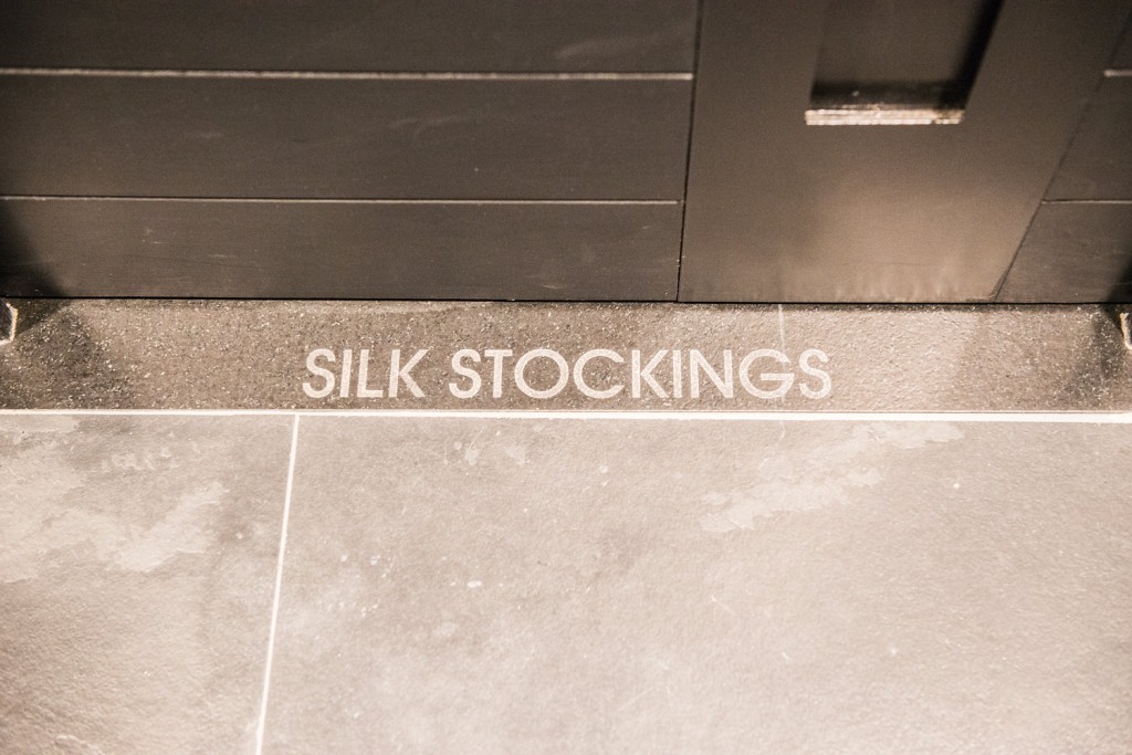
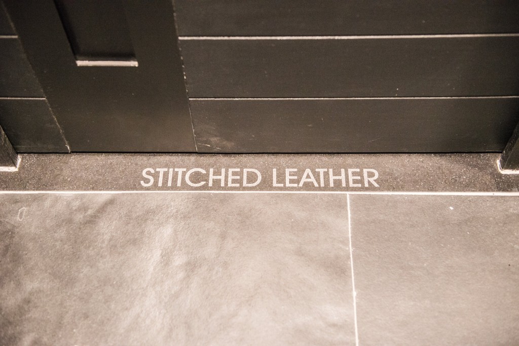
This level of detail was also extended to the witty, unusual signage for the bathrooms. Lettering has been etched into the granite floor, revealing the words “Silk Stockings” that denote the women’s bathroom, and “Stitched Leather” to identify the men’s section.
The boardroom table – another custom design- was particularly technically challenging to produce. It consists of glass, stretched leather and plate steel that have all been cut up at diagonals to reflect the style of the reception area.
In addition to customization, another standout feature of the space is the disciplined execution of a very slick, linear aesthetic. All the lines are straight and linear – it is very crisp. This lends the space zen-like minimalism that contributes to a peaceful, quietly confident mood.
Furthermore, almost every room has maximum daylight exposure and fantastic views, which allowed Inhouse to use very bold, dark materials throughout. This gives the space a strong, solidly masculine appeal that builds trust – just like BBG itself!
