
Nature is calling with Plascon’s Colour Combination of the year for 2022, featuring earthy Africa-inspired hues

With the New Year upon us, Plascon welcomes freshness and rejuvenation as we edge closer to a post-pandemic world. For South Africa’s foremost coatings brand, 2022 symbolises more than just a new beginning, but a newfound appreciation for our wellbeing and an opportunity to create positive transformation. What better way to feel restored and reset than by looking to the healing properties of nature?
Just as in nature, colours come to life in harmony. This is why for 2022, Plascon has brought together three beautiful hues in a combination to capture the mood of the year. These colours pay homage to the natural African landscape outside of our homes while bringing the simple pleasures of nature inside. A true pioneer, Plascon is the first in its industry to give three colours – and not just one – the noteworthy ‘Colour of the Year’ title, ensuring a more usable and design-friendly palette.
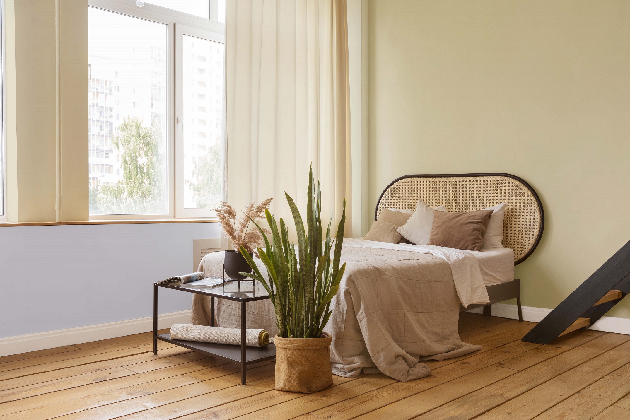
The Colour Combination for 2022 works in a 60:30:10 ratio. This aligns with best design practices that the industry utilises, which suggests that 60% of a space should consist of a dominant colour, 30% a secondary colour, and 10% an accent colour. Plascon therefore makes it easier for architects, interior design, decor professionals and members of the public alike to adopt this approach and tastefully achieve a well-considered look. Suitable for both interior and exterior schemes, the three shades each explore various elements of nature.
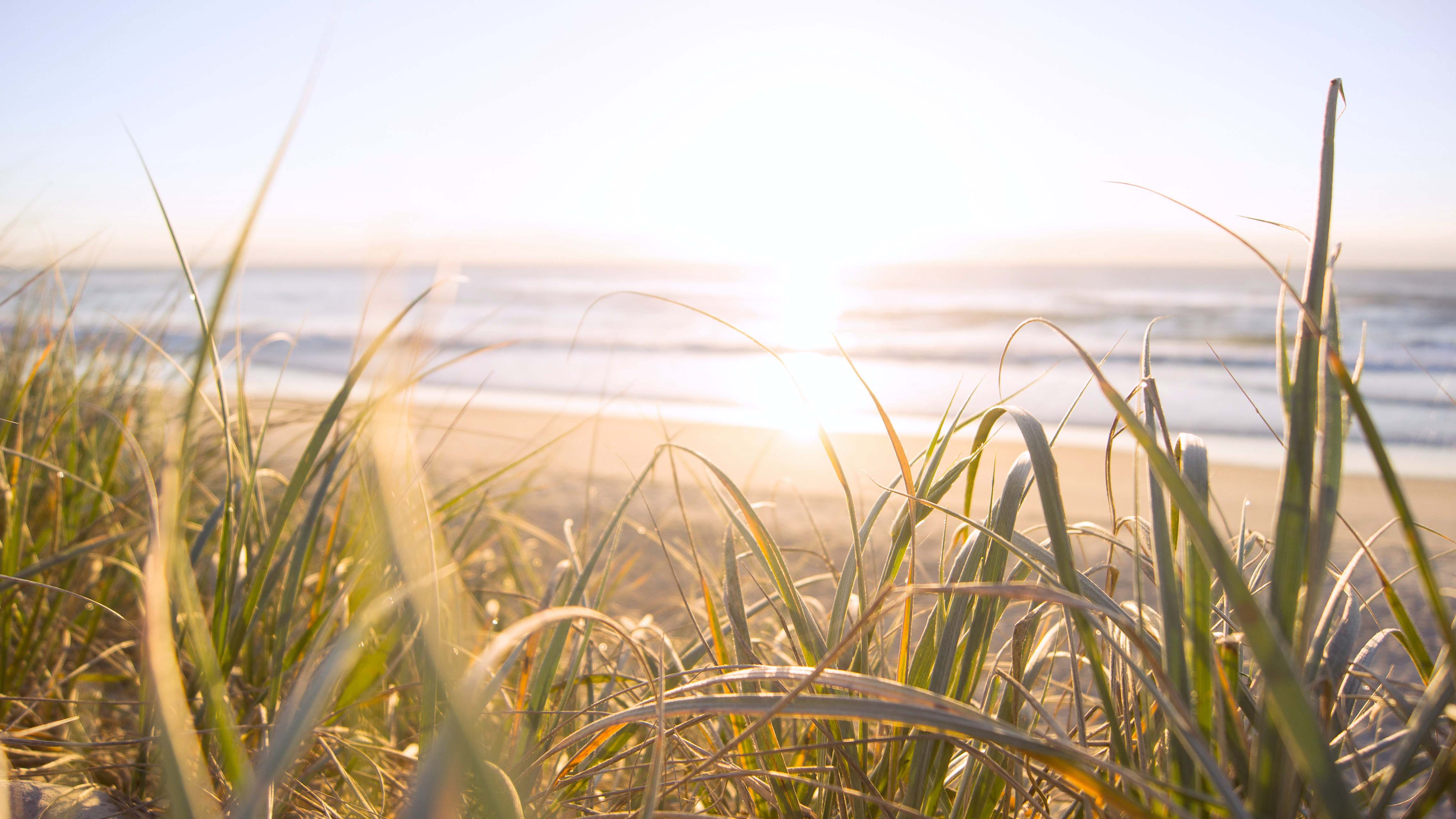
Plascon’s hero – or dominant – colour representing 60% of the ratio is Plascon Pear Fantasy (Y5-B2-1). This soft yellow-green makes for a modern, neutral shade while being comfortingly familiar. Capturing the soothing charm of a sandy shore at sunrise, this shade instantly puts our minds at ease and enlivens our spaces.
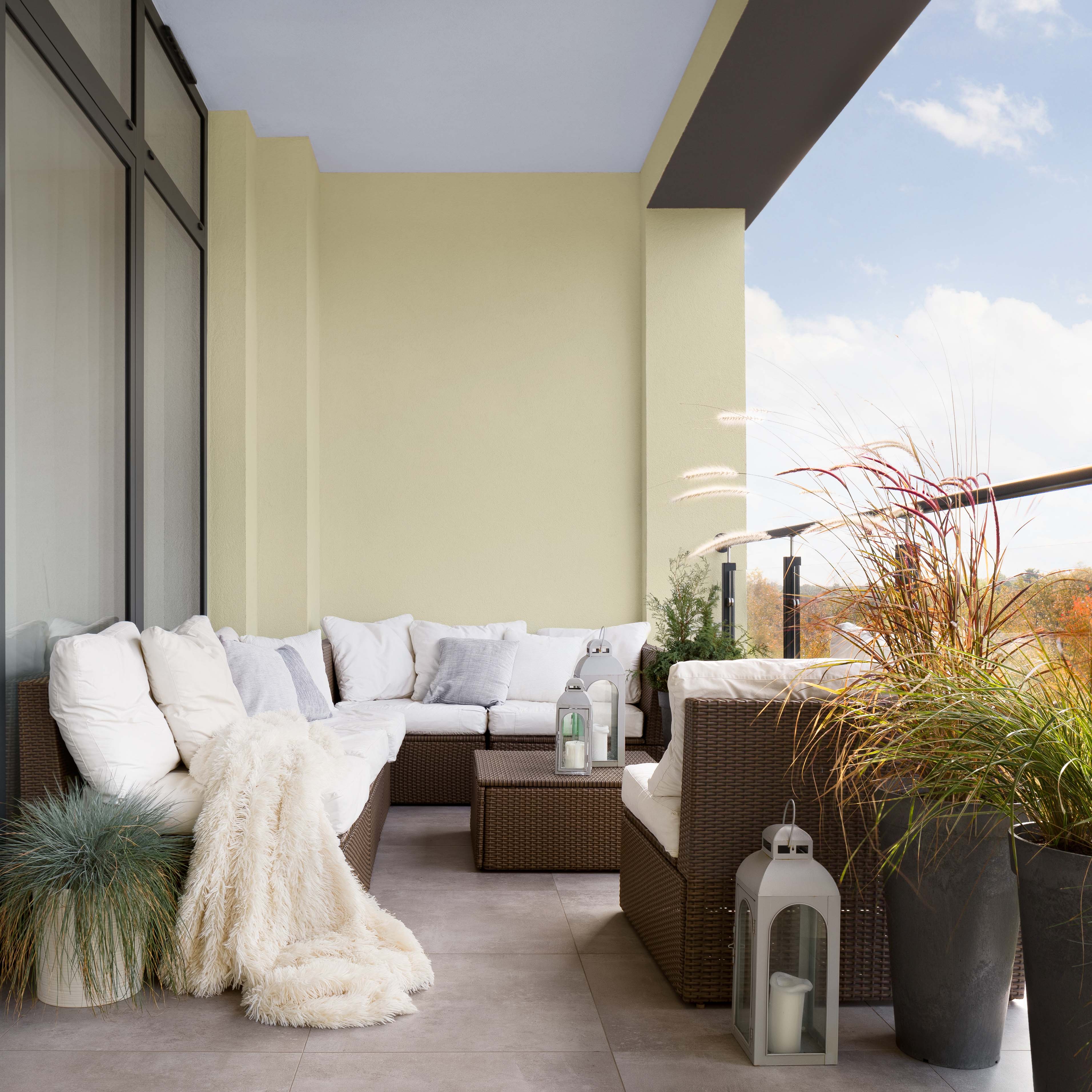
Constituting 30% of the Colour Combination ratio is Plascon Desert Water (B5-B2-2) – a calming and uplifting pale blue hue with an illuminating touch of purple. Inspired by the sunlit surface of tranquil water, this shade is subtle yet impactful, perfectly complementing the neutral Pear Fantasy. Lighter blue shades are associated with health, healing, tranquillity, and softness.
Rounding off the ratio of impeccably matched shades that emulate the essence of nature, Plascon Zanzibar (70) makes up the final 10% of Plascon’s Colour Combination for 2022. A soft yet grounded colour, there’s a quiet warmth to this gentle smoky brown that brings an anchoring balance to lighter, cleaner hues. Capturing the fresh soil and majestic tree trunks of an early morning trail, this colour brilliantly accentuates the Plascon Pear Fantasy and Plascon Desert Water.
Notably, the combination has been chosen to reflect a specifically African context, from the actual colours themselves to their very names. “Often, trends that filter down to us from Europe or the USA are designed for that context, and not an African reality. Here, we are bringing together colours that reflect the way we live here, and that are created with Africa in mind,” says Plascon’s head of marketing Suvasin Moodley.
Plascon furthers its commitment to innovation with its Colour Combination for 2022. With the brand’s sensitivity to context and its thoughtfully selected colours, the palette encourages optimism, calm, and balance. Set the tone for the New Year by injecting fresh life into your space with this tranquil yet uplifting trio that speaks of home in so many ways!
For free advice on how to use the Colour Combination for 2022, or any other Plascon colours, please contact the Plascon Colour Advice team via email: ColourAdvice@kansaiplascon.co.za


