The legendary Black Lion of the Cape of Good Hope reimagined by renowned international illustrator
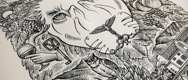
The gloriously black-maned, super-sized Cape Lion was first discovered at the Cape of Good Hope in 1842. Recognised as a distinct subspecies and closely related to the lions of southern and east Asia, the Cape Lion is thought to have evolved its remarkable ebony mane and increased stature due to its geographical isolation.
It was larger as a species than other lions, with black tipped ears and an abundant, sooty mane that stretched to its underbelly. It was a formidable creature. A potent emblem of the stormy, wild Cape and the majestic mountains of its escarpment, the Cape Lion endures in our imagination and history as a powerful symbol of strength.
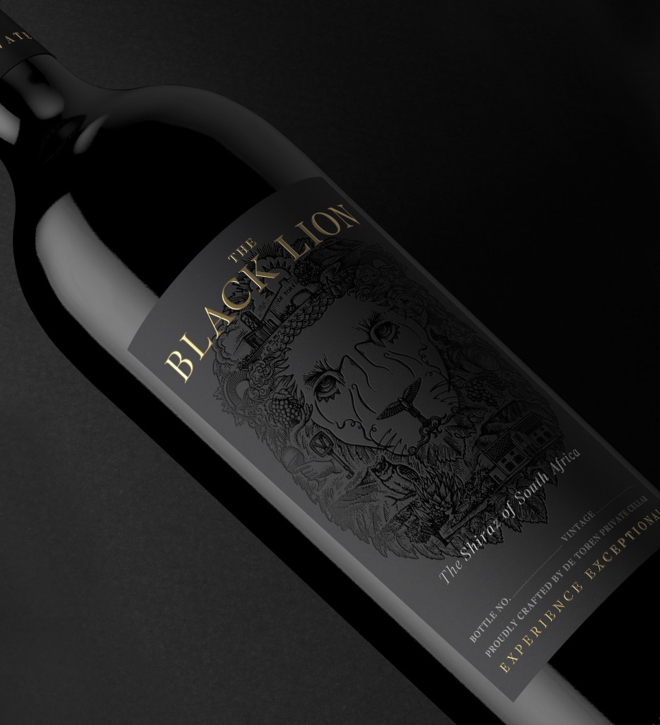
The official coat of arms of the Cape Colony has a lion at its centre. Similarly, The Black Lion is an extraordinary collectors’ wine produced by award-winning organic estate De Toren, which is situated on the Polkadraai Hills in Stellenbosch, the very landscape where the Panthera leo melanochaita would once have roamed.
Hailed as one of the most luxurious 100% Shiraz ever produced in South Africa, De Toren’s The Black Lion is a large, bold and powerful wine, a masterful alchemy of hand-chosen fruit. The Black Lion is South Africa’s highest rated Shiraz ever, as ranked by the globally respected Wine Enthusiast magazine. Wine Enthusiast is not the only leading wine authority to recognize The Black Lion’s merits. The wine was awarded the honorary title of SA’s Most Powerful Shiraz in the annual Wine Cellar Top Luxury Wines Tasting, sharing first place with its Bordeaux-styled equivalent, Book XVII. An answer to the challenge of creating ‘the best wines in the world’, and certainly a King of its jungle, this Shiraz sets the benchmark, and it is a fitting tribute to its namesake.
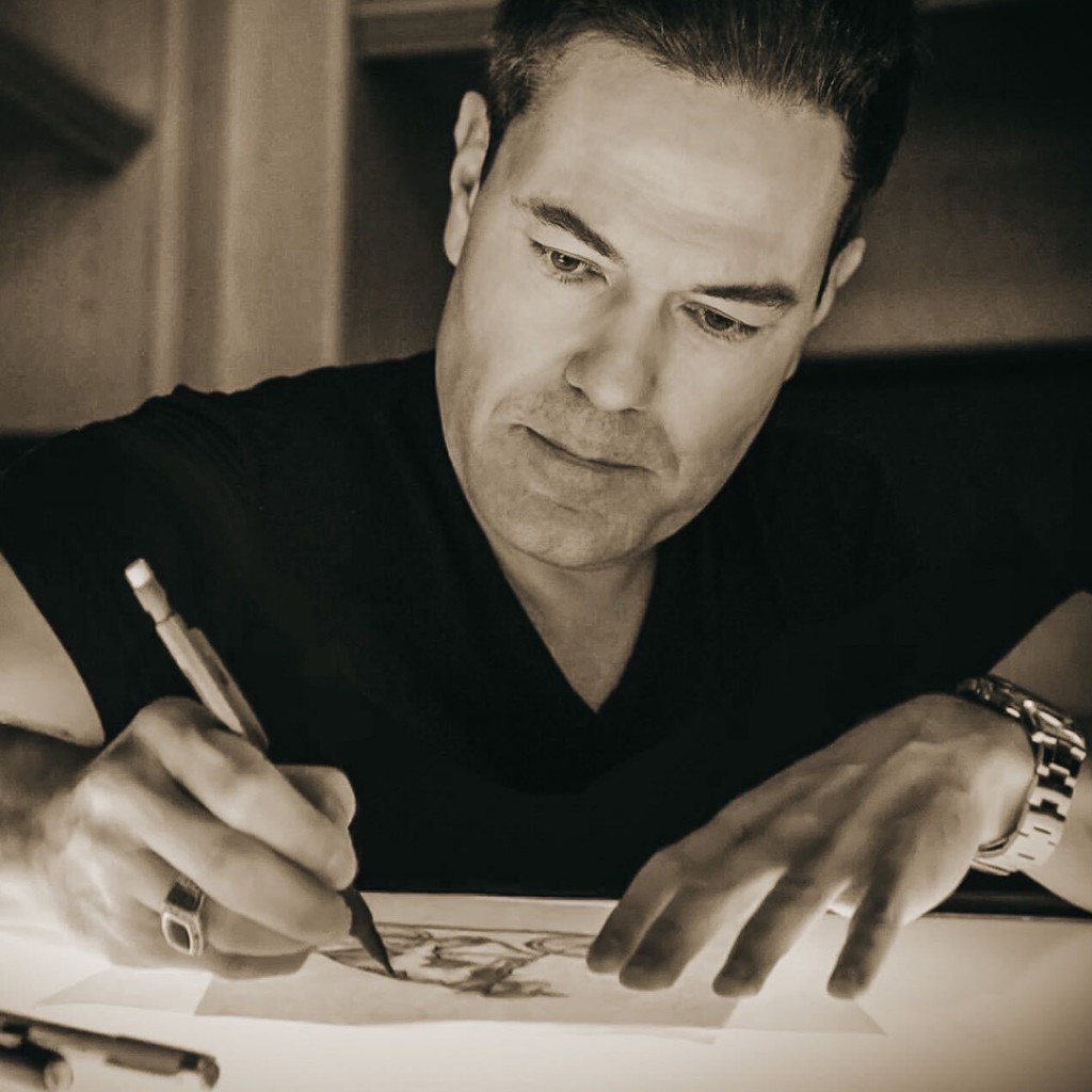
In order to create a new label design befitting the stature of both the wine and its eponymous feline, the internationally recognized illustrator Steven Noble was commissioned to create a unique artwork. Noble hails from the United States and crafts custom commercial illustrations for clients across the globe. He started illustrating almost 29 years ago, back in 1991, and began a career specializing and mastering in the scratchboard engraving and woodcut technique.
De Toren’s creative agency Pure contacted Noble to work collaboratively on the project. The inspiration for the label, the illustrator explains, “came through researching the estate’s history, heritage and all the iconic elements that, combined, produce the world-class De Toren wines.”
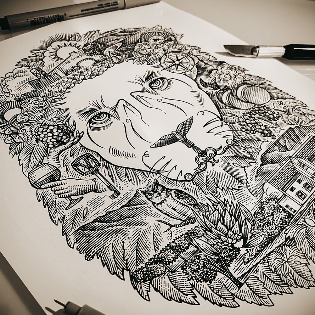
Noble then incorporated all the individual symbolic elements found in the De Toren story into one united image of The Black Lion. A proud, striking lion’s face gazes at you from the bottle. On closer inspection, individual elements appear, and various stories unfold…“The elements are comprised of relevant icons and components related to the history of the estate, as well as the future and progression of it, as well as the wines, and these make up an illustrated story, while also creating a lion’s face to depict The Black Lion varietal. From the backdrop of the Helderberg mountain range leading onto the view of Table Mountain and the sea-filled winds blowing from False Bay, this is all encapsulated within the label,” the illustrator continues.
It is Noble’s hope that when people gaze at the label, they will “feel the pride, heritage, and roots of South Africa, and its ancient soils that help produce the wine, all encapsulated into this craftily montaged illustration.”
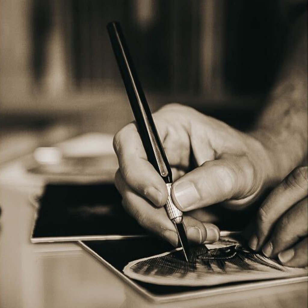
Appropriately, Noble executed his illustration in monochromatic tones, black being the dominant force, naturally. The artwork was created using the scratchboard technique for which he is renowned. Like all De Toren wines, the design was also produced carefully by hand. Noble used an X-Acto knife tool and carved from clayboard, with a composed preliminary sketch being placed onto the board to trace the general outline onto the surface. The rest of the detail was then improvised in between to create the shading and detail.
Speaking of the resulting image, De Toren’s Head of Marketing, Anja Bekker, states: “We could not be more thrilled with this astonishing rendition. The potency of the wine is captured in the design, which simultaneously honours the incredible, formidable creature for which our Shiraz was named. It’s no ordinary wine and it deserves something special – every bottle is meticulously handcrafted.”
Cellar Master, Charles Williams add: “We only hand-pick grapes from select vineyards from three very unique sites. The terroir of the Swartland lends the wine its raw power while the Helderberg and Polkadraai Hills, i.e., Stellenbosch, give that undeniable elegance. And just as the Cape Lion possessed raw power and elegance so too does this new label design!”
The result is indeed a striking depiction that captures the attention and captivates the imagination, raising thoughts of a mighty past and – just as the wine itself has a superb aging potential of 40 years plus/ 4 decades – the prospect of the future.
To learn more about Noble’s work visit www.stevennobleillustrations.com. To learn more about de Toren visit https://de-toren.com.
