Planning Ahead
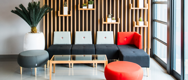
The Inhouse Brand Architects design team, led by Inhouse Director, Phillip Wyatt, was tasked with Project Real, a plan to redesign the national head office for Regent Insurance in Edenvale. This project followed on from a previous collaboration in 2014 in which Inhouse successfully completed a flagship fit-out for the company in Umhlanga. This involved a major rebranding exercise, the development of an upgraded corporate identity and the subsequent translation of this into a built environment. Having proved a major success, Regent was ready to extend the redesign and once again integrate their new branding into a built environment. Inhouse are specialists in this field and were brought on board to implement this change.
Regent Insurance’s GM of Marketing & Corporate Affairs, Michelle Ashen-Abrahams explains, “Our mission was to provide innovative, interactive and inviting open-plan corporate offices for our staff, customers and key stakeholders. With a new corporate identity in place we wanted to bring the brand to life and looked at Inhouse to develop our 3D corporate identity. Inhouse is experienced in taking a 2D corporate identity and translating that into a 3D experience which is what we needed at Regent to complete the newly launched brand.”
Prior to the redesign, the Regent head office was spread across six separate buildings with Regent owning five of these. The challenge for Inhouse was implementing international trends in effective space planning principles in order to downsize from six to five buildings– a move that has meant a significant saving in rental costs.
By redesigning the office layouts, Inhouse met the challenge of accommodating all six hundred and seventy staff members elegantly and spaciously, creating an improved work environment in the process.
In order to successfully execute this project without impacting on Regent’s productivity, Inhouse devised a project plan that meant that Regent’s staff would not have to down tools to make way for renovations. The project was split into three phases, and by alternating floors in different buildings, the installation was completed over a five-month period.
“This project was a long term cost management and space planning exercise and so it was imperative that we drew from the space planning principles we developed in our Durban flagship, by having people in open-plan settings with bench-style seating,” explains Wyatt.
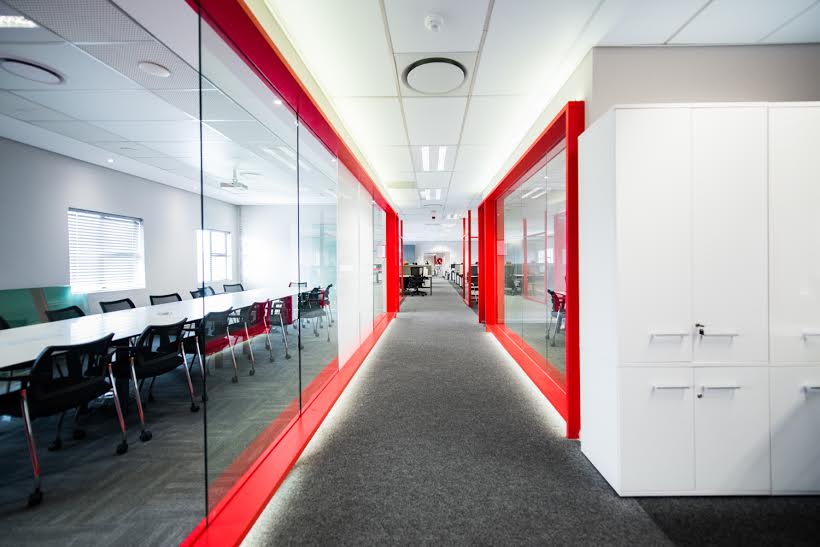
With Inhouse’s guidance, Regent pushed the boundaries by ensuring that the open-plan design was consistently implemented and there were no exceptions to the rule. Instead of corner offices, executive and senior management staff now has spaces demarcated by glass screens. The executive management has screened elements and cupboard walls in place of the conventional office format that is common in most executive environments. By eliminating the need for corner offices, there were more spaces for pause areas, campsites and informal meeting zones.
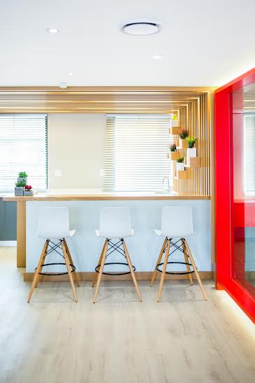
In conjunction with the considerable gains resulting from the new open-plan layout, Inhouse created even more floor area by centralizing printer stations, allowing only one per floor and introducing one pause area per floor. To give the illusion of space, glass is consistently used throughout, giving the offices a modern and spacious look. Vermillion was used to highlight and frame the screened glass walls of the individual “office” spaces as well as the dividing walls demarcating the meeting rooms.
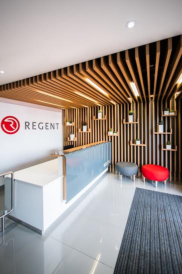
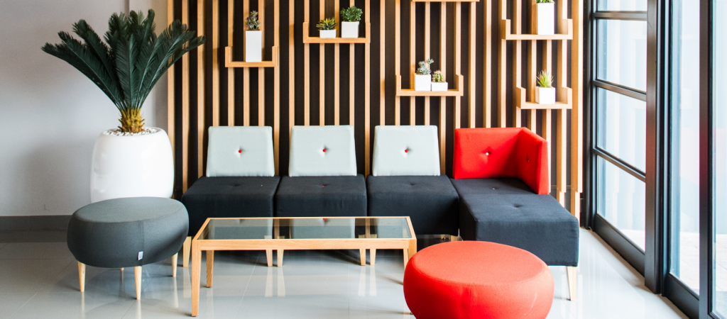
The overall aesthetic of the space take its cue from Regent’s corporate colours. Grey and vermillion are used throughout, with red as a statement-making accent colour in the interior scheme. Colour, cutout elements and the use of wood are recurring themes in the design execution. On arrival at the Regent offices, the first point of contact for visitors is the reception area, which showcases a steel cutout of the Regent logo, back lit in its corporate colours behind the welcome desk. Chairs in Regent’s corporate colours – grey and vermillion – are on display.
The contrast between the bold red and demure grey is skillfully incorporated throughout the buildings, present in the furniture items, reception areas, auditorium, pause areas and meeting rooms.
The redesign of the Regent buildings has improved communication and staff integration largely due to the open-plan layout. Bilal Adam, Regent’s CFO, strongly believes that the redesign has brought on a positive change internally. “My team and I all agree categorically that Project Real is a massive success. Not just the process, but also the results. Our new offices, as well as the new Head office, are absolutely breathtaking! We’ve come to also realise how valuable the glass and shared spaces have been in increasing our productivity and social engagement with one another. One should never under estimate the power of working environments on both culture and productivity in an organisation,” he says.

